Exposure and Tone Adjustments
Unlock the secrets of perfect photos by mastering exposure and tone adjustment.
Ever stared at a photo and felt something was "off" – too dark, too bright, or just lacking that visual punch? Understanding exposure and tone is the bedrock of compelling photography. This article dives deep into how to master the fundamentals of exposure and tone adjustments, transforming your images from ordinary to extraordinary.
We'll explore the essential concepts, starting with the foundational principles that make every edit shine. You'll learn to navigate your tonal roadmap using the histogram and discover the core tools that give you precise control. Get ready to unlock the secrets to perfectly balanced light and shadow in your photos.
Essentials
The Foundation of Every Great Photo Edit
In the world of digital photography, it’s tempting to jump straight to the exciting, creative edits—applying a stylish color grade, adding a dramatic vignette, or sharpening every last detail. But before you touch any of those tools, the most crucial work has already begun. Mastering exposure and tone is not just a preliminary step; it is the fundamental structure upon which every successful photograph is built. Get this right, and everything else falls into place.
Why Exposure and Tone are the First Steps
Think of editing as building a house. You wouldn’t start decorating the walls before the foundation is poured and the frame is secure. Exposure and tone are that foundation. These initial adjustments establish the overall look and feel of the image, correcting the fundamental properties of light before any creative choices are made.
If an image is too dark or too bright, its colors will not render accurately. An underexposed photo will have muddy, overly saturated colors, while an overexposed one will look washed out and pale. By first establishing a balanced tonal range, you create a neutral and accurate canvas. This ensures that when you later move on to color correction or creative grading, the tools behave predictably and the colors you see are true. In short, every other adjustment you make is directly influenced by your initial exposure and tonal settings.
Setting the Mood and Impact
Beyond technical correction, exposure and tone are your primary tools for storytelling. The brightness and contrast of an image are the first things a viewer perceives, instantly setting the emotional tone.
- Brightness is a powerful mood-setter. A bright, airy image with soft shadows often feels optimistic, clean, and gentle. This “high-key” look is popular in portrait, wedding, and lifestyle photography. In contrast, a darker image with deep shadows can feel dramatic, mysterious, or intimate. This “low-key” approach lends a cinematic quality and can evoke a sense of solemnity or intensity.
- Contrast is how you direct the viewer’s attention. The human eye is naturally drawn to the areas of an image with the greatest difference between light and dark. By increasing contrast, you can make your subject stand out from the background, creating a sense of depth and focus. By carefully managing it, you guide the viewer’s gaze through the frame, telling them what is important and what is secondary.
Mastering these foundational elements gives you control not just over the technical quality of your photo, but over its very soul.
Understanding Your Tonal Roadmap: The Histogram
Before you touch a single slider, it’s crucial to consult your photo’s most honest critic: the histogram. This simple graph might look intimidating, but it’s the single most important tool for understanding the tonal data in your image. Think of it less as a technical chart and more as a roadmap, showing you exactly where all the light and shadow information is located.
What is a Histogram?
In simple terms, a histogram is a bar graph that visualizes the brightness levels of all the pixels in your photograph. It maps out the entire tonal range, from the darkest parts of your image to the very brightest. The horizontal axis of the graph represents the brightness level, starting with pure black on the far left, moving through shades of gray in the middle, and ending with pure white on the far right. The vertical axis represents the quantity of pixels at each specific brightness level.
How to Read a Histogram
Learning to interpret a histogram is a foundational skill in photo editing. Once you understand its components, you can diagnose an image’s exposure issues at a glance, without relying solely on how it looks on your specific screen. Here’s a breakdown of the key areas:
- The Left Side: This area represents the shadows and blacks in your image. A lot of information bunched up here indicates a dark photo with significant deep tones.
- The Middle Section: This is the domain of the midtones. For many well-exposed photos, the majority of the data will be concentrated in this central part of the graph. This is where most of the core subject detail often lies.
- The Right Side: This section shows the highlights and whites. A large amount of data here suggests a very bright image, like a snowy landscape or a well-lit studio shot.
- The Height of the Graph: The peaks and valleys tell you the concentration of pixels. A tall spike means many pixels share that exact same level of brightness, like a large, uniformly colored sky.
Identifying Problems with the Histogram
A histogram doesn’t just describe your image; it helps you identify potential problems before you even begin editing. There is no single “perfect” histogram shape—a dark, moody night scene will naturally have a different histogram than a bright, airy beach photo. However, the graph is excellent at warning you about lost detail.
- Clipping: This is the most critical issue a histogram reveals. When you see a large, sharp spike pressed firmly against either edge of the graph, it signifies “clipping.” A spike on the far left means you have “crushed blacks,” areas of pure black with no texture or detail. A spike on the far right indicates “blown-out highlights,” areas of pure white where all detail has been lost and is often unrecoverable. Learning about the exposure range can help you avoid this.
- A “low-key” image: If the graph’s data is heavily concentrated on the left side, you have a low-key image. This isn’t necessarily a problem; it’s characteristic of night photography or dramatic, shadowy portraits.
- A “high-key” image: Conversely, if the data is bunched up to the right, you have a high-key image. This is typical for bright, minimalist scenes, photos in the snow, or images with a light, airy aesthetic.
By understanding these patterns, you can make informed decisions. Is your image intentionally low-key, or is it simply underexposed? Is that bright sky a stylistic choice, or have you lost all the beautiful cloud detail? The histogram gives you the objective data you need to answer those questions. This is a key part of understanding your image data and forms the basis for many post-processing techniques.
The Core Tools for Exposure and Tone
Once you understand the histogram, you can start making meaningful adjustments. Most editing software, from Lightroom to mobile apps, provides a core set of sliders that control the tonal values of your image. While they may seem similar, each has a distinct and crucial role. Mastering these tools is the key to unlocking a balanced and impactful edit. This is a fundamental part of introduction to post-processing and editing.
Exposure: Setting the Overall Brightness
The Exposure slider is your master control. It’s the first and most powerful tool for adjusting the overall brightness of the entire image. Moving it to the right brightens everything—shadows, midtones, and highlights—simultaneously. Moving it to the left darkens the entire scene. Think of it as mimicking the camera’s shutter speed or aperture after the fact. Understanding this is key to achieving proper exposure and is a core concept within the exposure triangle.
You should use the Exposure slider first to establish a good baseline for your image’s luminosity. If a photo is significantly underexposed or overexposed, this is the tool to fix the fundamental problem before you move on to more nuanced adjustments, as it directly impacts the exposure range.
Contrast: Defining Separation
Contrast is the degree of difference between the light and dark areas of an image. Increasing contrast makes the bright tones brighter and the dark tones darker, creating more separation and “pop.” Decreasing it brings those tones closer together for a flatter, softer look.
- Global Contrast: The standard “Contrast” slider affects the entire image uniformly. It’s a broad tool that can quickly add impact.
- Local Contrast: Tools often labeled “Clarity” or “Texture” are forms of local contrast. They increase the tonal separation between smaller, adjacent areas, which can enhance detail and perceived sharpness without drastically altering the overall brightness. Learning how to use these is part of effective local adjustments and retouching.
A word of caution: the global contrast slider is powerful but blunt. Pushing it too far can lead to crushed blacks and blown-out highlights, sacrificing detail for drama. A little often goes a long way. This is a common topic in discussions about post processing in photography.
Highlights and Shadows: Recovering Detail
These two sliders are your precision instruments for detail recovery. Unlike the Exposure slider, they target specific ends of the tonal spectrum, leaving the midtones largely untouched.
- The Highlights slider specifically targets the brightest parts of your photo. If you have a bright sky where the clouds are washed out, pulling this slider down can often recover that lost color and detail without darkening the rest of the image. This is a key technique in color correction and enhancement.
- The Shadows slider does the opposite, targeting only the darkest areas. If a subject’s face is in shadow or details are lost in a dark forest, lifting this slider can reveal that hidden information without washing out the entire scene.
It’s crucial to understand that these are fine-tuning tools, not replacements for the Exposure slider. They are designed for targeted recovery in specific tonal ranges. Using the Shadows slider to fix a severely underexposed photo will often result in a flat, noisy, and unnatural image. Always correct major brightness issues with Exposure first, then use Highlights and Shadows to refine. This contributes to a guide to elevating your photography.
Whites and Blacks: Setting the Dynamic Range
While Highlights and Shadows refine the ends of the tonal scale, the Whites and Blacks sliders define them. They set the absolute brightest and darkest points in your photograph, establishing its full dynamic range.
- The Whites slider sets the “white point.” This means it determines which pixels in your image will be rendered as pure, detail-free white. Pushing it up makes the brightest parts of the image even brighter.
- The Blacks slider sets the “black point,” defining what will be rendered as pure, detail-free black. Pulling it down deepens the very darkest parts of the image.
Adjusting these two sliders is often the secret to making a flat, lifeless image feel rich and dynamic. By setting a true black point and a clean white point, you ensure your photo uses the full available tonal spectrum, which adds incredible depth and punch. This process is also crucial when RAW processing your images.
A Step-by-Step Workflow for Balanced Adjustments
While it can be tempting to jump around between sliders, a methodical approach to tonal adjustments yields cleaner, more predictable results. By working from the broadest adjustments to the finest, you build a solid foundation for your edit. Follow this four-step process to bring balance and depth to any photo.
Step 1: Correct Overall Exposure
Before you do anything else, establish a good baseline for your image’s brightness. The Exposure slider is your master control for this. The goal here isn’t perfection, but to get the image into a comfortable middle ground. Is the photo fundamentally too dark or too bright? Make a single, broad adjustment to correct it.
As you adjust, keep a close eye on your histogram. You want to shift the main body of the graph so it’s more centered, without pushing a significant amount of data hard against either edge. This initial step ensures your subsequent, more nuanced adjustments are working with a well-exposed foundation. Learn more about achieving proper exposure.
Step 2: Set the Black and White Points
With the overall exposure in a good place, the next step is to define the full dynamic range of your photograph. This is arguably the most impactful adjustment for turning a “flat” RAW file into a dynamic image. This is done with the Whites and Blacks sliders.
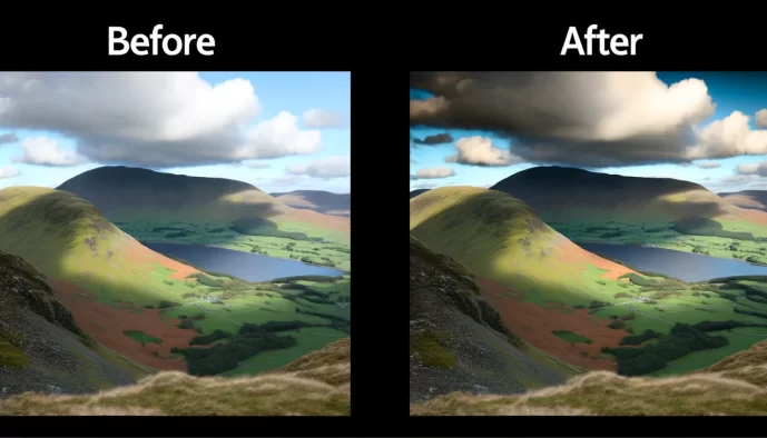
- Set the White Point: Increase the Whites slider to make the brightest parts of your image a clean, true white. Watch the right side of the histogram. Push the slider until the graph just begins to touch the right edge. This adds brightness and sparkle without “blowing out” important highlight detail.
- Set the Black Point: Decrease the Blacks slider to make the darkest parts of your image a deep, true black. Watch the left side of the histogram. Pull the slider down until the graph just kisses the left edge. This adds depth and prevents the image from looking washed out.
Imagine a flat, low-contrast photo of a landscape. Before this step, the sky might look grey and the shadows murky. After setting the white and black points correctly, the clouds become a brighter white, the shadows gain a rich depth, and the entire scene suddenly has a powerful sense of dimension and punch. Understanding the exposure range is key to this process.
Step 3: Recover and Refine with Highlights and Shadows
Now that you’ve set the absolute brightest and darkest points, it’s time to fine-tune the tones in between. This is where you reclaim lost detail in the extreme ends of your exposure without altering the entire image.
The Highlights slider is perfect for taming overly bright areas. If the clouds in your sky or the white fabric of a shirt are losing texture, gently pull this slider down. You’ll see detail reappear without making the whole photo darker. Conversely, the Shadows slider is used to lift dark areas and reveal what’s hidden. If details in a dark forest or a person’s hair are lost in blackness, gently push this slider up to bring them back into view. These tools are for surgical refinement, not for rescuing a terribly exposed photo. For more targeted edits, consider learning about local adjustments and retouching.
Step 4: Add Punch with Contrast
Finally, with all your tonal foundations in place, you can add a final touch of global Contrast. Because you’ve already set your dynamic range with the Whites and Blacks sliders, you often need only a very small adjustment here. A slight increase can add a bit of separation to the midtones, making the image “pop” just a little more.
This is a subjective step, so adjust to taste. Be careful not to overdo it, as too much contrast can make the image look harsh and sacrifice the subtle detail you just worked to recover. Once you’re done, toggle the before-and-after view. You should see a dramatic improvement in depth, clarity, and overall impact, all from just a few deliberate tonal adjustments. This workflow is a fundamental part of post-processing and editing in photography.
Advanced Tonal Control: The Tone Curve
Once you’ve mastered the basic sliders, you might find yourself wanting more granular control over the tones in your image. This is where the Tone Curve comes in. While it can seem intimidating at first, the Tone Curve is arguably the single most powerful tool for adjusting exposure and contrast, offering a level of precision that sliders simply cannot match. Understanding this is a key part of post-processing in photography.
A Quick Introduction to the Tone Curve
Think of the Tone Curve as a more advanced version of your histogram. It’s a graph where the horizontal axis represents the original brightness levels of your image (the “input”), from black on the left to white on the right. The vertical axis represents the new, adjusted brightness levels (the “output”). By default, the curve is a straight diagonal line, meaning the input and output are identical—no changes have been made.
The magic happens when you click and drag this line. The most common adjustment is the classic “S-curve.” This is created by adding a point in the lower half of the line and dragging it down slightly, and adding another point in the upper half and dragging it up. By pulling down the shadow point, you make the dark tones darker. By pushing up the highlight point, you make the bright tones brighter. The result is a smooth, natural-looking increase in contrast that gently affects the entire tonal range.
The S-curve is popular because it mimics how film and our own eyes perceive contrast. It adds depth and punch without the often harsh effect of a simple contrast slider. You can also add as many points as you need to the curve, allowing you to make very targeted adjustments. For example, you could brighten the darkest shadows while simultaneously darkening the light-midtones, all without affecting the brightest highlights. This kind of fine-tuning is essential for color correction and enhancement.
When to Use the Tone Curve Instead of Sliders
While the basic sliders are fantastic for quick, broad adjustments, the Tone Curve excels in situations requiring more finesse. It’s not an either/or choice; many professionals use the sliders for initial corrections and then switch to the curve for final, precise refinements. This is a crucial step in post-processing.
- For more nuanced and precise control over contrast. The global Contrast slider applies its effect fairly uniformly across the image. With the Tone Curve, you can decide exactly where to apply contrast. You could, for instance, boost contrast only in the midtones to make your subject pop, while keeping the shadows soft and the highlights gentle to avoid clipping. This surgical control is the primary reason photographers turn to the curve, and it’s a key element in achieving proper exposure.
- For creating specific stylistic effects. The Tone Curve is the key to unlocking many popular editing styles. A common example is the “matte” or “faded film” look. This is achieved by grabbing the very bottom-left point of the curve (the black point) and dragging it straight up. This action dictates that nothing in the image can be pure black, giving the shadows a soft, washed-out quality. Similarly, you can pull the top-right point (the white point) down to fade the highlights, creating a dreamy, vintage feel. These effects can be part of your creative effects and filters.
Common Pitfalls and How to Avoid Them
As you gain confidence with tonal adjustments, you’ll discover their immense power. However, with great power comes the potential for over-editing. Understanding the most common pitfalls is the first step toward creating edits that are both impactful and believable. Here are three key issues to watch out for.
“Crushing” the Blacks
“Crushing the blacks” is a term for when the darkest areas of your image are pushed to pure, solid black, completely erasing any underlying texture or detail. While a deep black point is essential for creating contrast and depth, going too far can make parts of your photo look like an unnatural, inky void. Think of a dark woolen coat that loses all its fabric texture or shadows in a forest that become flat, black shapes.
Your histogram is the best tool for identifying this issue. When you see a tall, sharp spike pressed directly against the far-left edge of the graph, it signifies that a large number of pixels have been “clipped” to pure black. A little clipping can be acceptable, especially in scenes with deep, natural shadows, but a large, compressed spike often indicates a significant loss of detail.
“Blowing Out” the Highlights
The counterpart to crushed blacks is “blowing out” the highlights. This happens when the brightest parts of your image become pure, solid white, with no detail whatsoever. This is often seen in skies that look like a blank white canvas instead of having subtle cloud formations, or on bright surfaces like a wedding dress or sunlit water that lose all their delicate texture.
On the histogram, this appears as a spike slammed against the far-right edge. Blown-out highlights are generally considered a more critical problem than crushed blacks. Digital camera sensors are much better at retaining information in underexposed (dark) areas than in overexposed (bright) ones. Once highlight detail is clipped to pure white during the initial capture, that information is often permanently lost and cannot be recovered, no matter how much you adjust the Highlights slider.
The Unnatural “HDR” Look
One of the most common signs of an over-edited photo is the unnatural “HDR” (High Dynamic Range) look. This typically happens when an editor pushes the Shadows slider too far to the right and pulls the Highlights slider too far to the left in an attempt to recover every last bit of detail. The result is an image with flattened contrast, strange “halos” or glows around objects, and a muddy, unrealistic appearance.
While the goal is to balance the light, the key is to do so while maintaining a believable sense of light and shadow. Here are a few tips to keep your edits looking natural:
- Be Subtle: Make small, incremental adjustments. The goal is to reveal detail, not to make shadows as bright as the midtones.
- Protect Your Anchor Points: Even after lifting shadows and taming highlights, ensure you still have a true black and a true white in your image to maintain overall contrast and depth.
- Use Local Adjustments: If only one part of the image has a shadow that’s too dark, use a brush or gradient filter to brighten just that area instead of applying a heavy-handed global adjustment.
- Compare Frequently: Toggle the before-and-after view often. This helps you keep perspective and ensures your edit is genuinely improving the photo, not just making it look different.