Using Balance & Visual Weight in your compositions
Master photo balance with our guide on composition, symmetry, and visual weight.
Ever wondered why some images just *feel* right, while others seem a little… off? It's not magic; it's the subtle art of balance and visual weight. Understanding how to use these elements is key to creating compelling and harmonious compositions that draw the viewer in and guide their eye.
In this article, we'll demystify the unseen forces at play, exploring the concept of visual weight and diving into the four fundamental types of balance. Get ready to learn practical techniques that will transform your creative work, from photography and graphic design to painting and beyond. We'll show you exactly how to put theory into practice to achieve stunning visual results.
Essentials
Understanding Visual Weight: The Unseen Force in Composition
Defining Visual Weight
Imagine every element in your photograph or design has its own unique magnetic pull. Some objects are powerful magnets, instantly drawing your gaze, while others are weaker, noticed only after a moment. This pull is visual weight. It’s not about the physical heaviness of an object, but its ability to attract the viewer’s eye. Think of it as a perceptual force, an unseen gravity that dictates where we look first and for how long. Mastering this concept is the first step toward creating compositions that feel intentional and compelling. Understanding how to balance these elements is key to great elevating your photography.
Why Visual Weight Matters
Understanding visual weight is like learning the grammar of visual language. It allows you to consciously direct the viewer’s experience, turning a simple snapshot into a carefully constructed story. By controlling the weight of different elements, you can achieve several crucial goals:
- Guide the viewer’s journey: You create a visual path, leading the eye from one point of interest to the next in a deliberate sequence. This is a core principle in using leading lines in your compositions.
- Establish clear focal points: You can make your intended subject the undeniable star of the show by giving it the most visual weight. This often ties into established principles like using the rule of thirds.
- Create a specific mood: The distribution of weight can make a composition feel stable and calm, or tense, energetic, and dynamic.
The Key Factors That Create Visual Weight
Visual weight isn’t created by a single property but is the result of many interacting factors. By learning to recognize and manipulate these, you gain precise control over your composition.
Size and Scale
This is the most intuitive factor. All else being equal, larger objects command more attention and therefore have more visual weight than smaller ones. A towering mountain will naturally feel heavier in a landscape than a small tree in the foreground.
Color and Contrast
Color has a powerful, subconscious effect on our perception. Warm colors like red, orange, and yellow tend to advance towards the viewer and feel heavier than cool colors like blue and green, which recede. Similarly, bright, highly saturated colors carry more weight than muted, desaturated tones. The strongest pull, however, often comes from contrast. A point of high contrast—like a black silhouette against a white sky or a single red apple in a green field—creates an incredibly potent focal point. Understanding color theory for photographers can greatly enhance this. This concept is also crucial when manipulating light and shadows.
Position in the Frame
Where an element is placed has a significant impact on its perceived weight. Objects located in the center or in the upper half of the frame tend to feel heavier and more dominant. An element that is isolated, with plenty of space around it, will also carry more weight than the same element when it’s clustered with a group of other objects. This relates to how we approach creative mobile photography compositions.
Texture and Complexity
Our eyes are naturally drawn to detail. An area with intricate texture, complex patterns, or fine detail requires more visual processing and thus feels heavier than a smooth, simple, or out-of-focus area. A rough brick wall has more weight than a clear blue sky; a detailed face has more weight than a simple shirt. This complexity can be found when using symmetry & patterns.
Shape and Form
The nature of an object’s shape contributes to its weight. Regular, geometric shapes (squares, circles) can feel heavier and more stable than irregular, organic shapes. However, some shapes have an intrinsic weight because of what they represent. The most powerful of these is the human form, especially the human face. Our brains are hardwired to seek out and focus on faces, giving them immense visual weight regardless of their size or color. This ties into how we consider point of view and perspective.
Negative Space
It might seem counterintuitive, but the absence of content can also have weight. Large areas of empty or “negative” space don’t just provide breathing room; they can become active compositional elements themselves. When negative space is used to isolate a subject or create a distinct shape, it can act as a powerful counterweight, directing the eye and contributing to the overall balance of the piece. This is a key aspect of using negative space in your compositions.
Achieving Harmony: The Four Types of Visual Balance
Once you understand the concept of visual weight, you can begin to arrange the elements in your frame to create a sense of harmony and intention. This arrangement is known as balance. While a perfectly balanced image feels complete and stable, an intentionally unbalanced one can feel tense and dynamic. Mastering the four primary types of visual balance gives you complete control over the mood and message of your work.
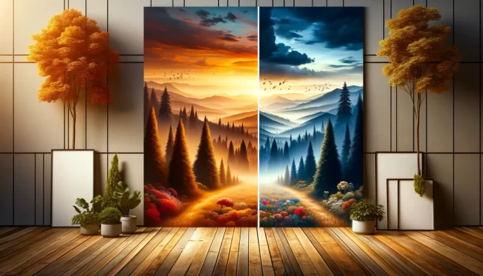
Symmetrical Balance: The Mirror Image
Symmetrical balance is the most straightforward and often the first type we learn. It occurs when elements of equal visual weight are placed on opposite sides of a central axis, creating a near-perfect mirror image. This axis can be vertical, horizontal, or even both.
The effect of symmetry is one of profound stability, order, and formality. It feels calm, intentional, and enduring, which is why it has been a cornerstone of classical art and architecture for centuries. Think of the perfect, serene reflection of the Taj Mahal in its reflecting pool, or the meticulously centered and ordered frames in a Wes Anderson film. These compositions feel deliberate, peaceful, and formally structured.
Asymmetrical Balance: The Dynamic Equilibrium
Asymmetrical balance is more complex but arguably more common and visually interesting. Instead of mirroring elements, it involves arranging objects with different visual weights in a way that still achieves a sense of equilibrium. The composition feels balanced, but the two sides are not identical.
This approach creates a more dynamic, modern, and natural feeling. It’s less rigid and often more engaging, as the viewer’s eye is encouraged to move around the frame to appreciate how the different elements offset one another. A helpful way to understand this is the “seesaw analogy”: imagine a large, pale, and simple object placed near the center of your composition. It can be perfectly balanced by a small, dark, and complex object positioned near the edge. The Dutch painter Piet Mondrian’s abstract works are a masterclass in this, balancing bold blocks of color with stark black lines to create a perfect, non-symmetrical harmony.
Radial Balance: The Circular Flow
In radial balance, all elements are arranged around a central point, radiating outwards or spiraling inwards. The visual weight is distributed in a circular pattern, creating a powerful focal point right in the middle of the design.
This type of balance naturally draws the viewer’s eye to the center and generates a strong sense of movement and unity. It can feel energetic, like a starburst, or meditative and focused. You can find radial balance everywhere in nature and design, from the petals of a flower and the ripples in a pond to bicycle wheels, spiral staircases, and intricate mandalas.
Crystallographic Balance: The All-Over Pattern
Also known as mosaic balance, crystallographic balance occurs when the frame is filled with elements of equal visual weight, resulting in a composition with no single focal point. The emphasis is distributed evenly across the entire image, creating a busy but uniform field.
The effect is one of texture and pattern. The eye doesn’t settle on one particular spot but instead scans across the surface, taking in the overall design. This technique is fundamental in textile design, wallpaper patterns, and abstract art. In photography, a shot of a dense field of wildflowers or a detailed mosaic tile floor would be excellent examples of crystallographic balance.
Putting Theory into Practice: Techniques for Balancing Your Compositions
Understanding the principles of balance is one thing; applying them is another. Moving from theory to practice requires a conscious effort to see your compositions not just as a collection of objects, but as an arrangement of visual weights. Here are some practical techniques to help you master the art of balance in your own work.
Conduct a “Weight Audit” of Your Work
Before you can adjust the balance of an image, you need to accurately assess where the weight lies. This can be difficult when you’re caught up in the details of the subject. Two simple tricks can help you see the bigger picture and analyze the underlying structure of your composition.
- Squint your eyes: This is a classic artist’s technique. By squinting, you blur out fine details, distracting textures, and complex lines. What remains are the primary shapes, colors, and areas of contrast. This simplified view makes it immediately obvious which elements are pulling the most weight and where the composition feels heavy or light.
- Convert the image to grayscale: Color can be a powerful, but sometimes deceptive, component of visual weight. By converting your photo or design to black and white, you remove the influence of hue and saturation. This forces you to analyze the balance based purely on tonal value and contrast, revealing the fundamental light/dark structure of your piece.
Using the Rule of Thirds for Asymmetry
The Rule of Thirds is often taught as a simple compositional guideline, but its true power lies in its ability to create effortless asymmetrical balance. When you place a key subject—an element with significant visual weight—on one of the four intersections of the grid, you are deliberately unbalancing the frame in a controlled way. The large area of negative space that occupies the other two-thirds of the image then acts as a natural counterweight. This creates a composition that feels far more dynamic and engaging than a centered subject, guiding the eye through the frame in a pleasing, balanced journey.
Balancing a Dominant Subject
Often, your composition will have a single, powerful focal point that carries the majority of the visual weight. If left unchecked, this can make the image feel lopsided and unstable. The key is to introduce secondary elements that act as a counterweight, creating a sense of equilibrium.
- Use a secondary element: Introduce a smaller, less significant object to balance your main subject. A large mountain on the left could be balanced by a small hiker on the right. The secondary element doesn’t need to be as “heavy,” but its placement provides a crucial point of interest that prevents the dominant subject from completely taking over.
- Position in the opposing quadrant: To maximize the balancing effect, place your secondary element in the area of the frame that diagonally opposes your main subject. If your dominant subject is in the upper left, a counterweight in the lower right will create a strong diagonal line that adds both balance and dynamic tension.
- Leverage negative space: Sometimes, the best counterweight is nothing at all. A large, dominant subject can be beautifully balanced by a generous amount of empty or negative space. This gives the subject “breathing room” and allows the emptiness itself to have presence and weight, resulting in a clean, confident composition.
Directing the Eye with Intentional Imbalance
While harmony and balance are often the goal, a deliberately unbalanced composition can be an incredibly powerful creative choice. By placing all the visual weight on one side of the frame, you can evoke specific and potent emotions in the viewer. An unbalanced image can create a sense of tension, unease, energy, or dramatic motion. It can make a scene feel chaotic or imply that something is about to happen just outside the frame.
This is an advanced technique that works best when it serves the story or mood you’re trying to convey. It’s a prime example of the creative principle: you must first understand the rules to know how to break them effectively. A successful unbalanced composition doesn’t feel like a mistake; it feels intentional, purposeful, and emotionally resonant.
Common Pitfalls: Avoiding Compositional Imbalance
Understanding the principles of balance is one thing; applying them consistently is another. Even experienced artists and photographers can fall into common compositional traps. By learning to recognize these pitfalls, you can consciously avoid them and strengthen your work, ensuring your visual message is clear, intentional, and effective.
The Overly Centered, Static Subject
The Problem: Placing your main subject directly in the center of the frame is often our first instinct. While this can work for creating formal, symmetrical balance, it frequently results in a composition that feels static, predictable, and devoid of energy. The eye lands on the subject and has nowhere else to travel, halting the visual journey before it even begins.
The Solution: The fix is often as simple as a slight shift. By moving your subject off-center, you immediately introduce a more dynamic asymmetrical relationship. This activates the negative space around the subject, creating a visual dialogue between the two. This simple adjustment encourages the viewer’s eye to move around the frame, making the entire image feel more engaging and alive. Explore how to achieve this through experimenting with angles and perspectives.
The “Bottom-Heavy” Composition
The Problem: When all the significant visual weight is concentrated in the lower half of the frame, the image can feel weighed down, stagnant, and oppressive. The top portion feels empty and disconnected, creating an uncomfortable imbalance that makes the entire composition feel like it’s sinking.
The Solution: To counteract this visual gravity, you need to create “lift.” Introduce a smaller element with significant visual weight into the upper portion of the frame. This doesn’t need to be a large object. A bright patch of color in the sky, a dark silhouette of a bird, or a small area of high contrast can act as the perfect counterweight. This secondary element balances the composition and allows the viewer’s eye to move vertically through the scene. Learning to effectively use depth and layering can also help distribute visual weight effectively.
Competing Focal Points
The Problem: This occurs when two or more elements have nearly equal visual weight and are both vying for the viewer’s attention. Instead of a clear path, the viewer’s eye bounces between the competing elements, unsure of where to rest. This creates visual confusion and dilutes the impact of your image, as no single subject is allowed to dominate.
The Solution: Establish a clear visual hierarchy. You must decide which element is the primary focal point—the star of the show—and which is the supporting actor. Once you’ve made this decision, actively reduce the visual weight of the secondary element. You can do this by making it smaller, reducing its color saturation, lowering its contrast, or even partially obscuring it. The goal is to create a primary point of interest that is supported, not challenged, by other elements in the frame. Mastering techniques like the rule of thirds can help avoid this issue.
Ignoring the Edges of the Frame
The Problem: The borders of your composition are incredibly powerful. When a visually heavy element is placed too close to the edge without sufficient space, it creates an awkward visual tension. This is often called “kissing the frame.” It makes the object feel cramped and can act like a magnet, pulling the viewer’s eye out of the composition entirely rather than guiding it within.
The Solution: Be decisive with your framing. Either pull the element further into the composition to give it adequate “breathing room” from the edge, or crop into it deliberately. A confident crop that cuts off part of the element suggests that the scene continues beyond the frame, which can be a dynamic choice. The ambiguous, tense placement is what to avoid. Ensure every element is either comfortably contained within the frame or intentionally and decisively cropped by it. Consider using the “frame in the frame” technique to naturally draw attention to your subject.